Monday 15 September 2014

Creative Blog Hop

My friend Veronica asked me to take part in this blog hop, so here I am! I am supposed to answer four questions, so here they are!
1. What am I working on now?

Well that's easy, like most other crafters I'm busy with Christmas stuff. I have a couple of events coming up that I need stock for, so I am spending my time in an inky, glittery world of my own.

2. How does it differ from others in my genre?

Now that is a bit harder. My blog is called Craft Eclectia because I don't stick to one specific type of crafting. I am mainly involved with papercraft, but I also knit, crochet and paint (but I'm rubbish at painting!) However within papercrafting I like to mix up techniques, there is often an element of parchment craft on my cards. I also have no problems with crafting with kits, however I always put my own spin on them.

3. Why do I create what I do?

Well simply because I cannot imagine a life where I am not creating things.

4. How does my creative process work?

I don't really have a process. Sometimes I just get an idea out of the blue, sometimes I see a stamp and instantly know what I want to do with it, but mostly I just play!

So the photo I am talking about today is a card topper made from a Brusho  background.
I spritzed some water onto a tile, added a few Brusho colours (just a few, any more than four and it all gets a bit murky, and you only need a tiny amount of the crystals). Spritz it again, then go and make a coffee whilst it all mingles and does its inky thing.
After a couple of minutes mop up the tile with a piece of watercolour card.
Leave it to dry and then stamp on top, using a permanent ink (I used black Archival). At this point I have to confess that the moon being left white was a happy accident, but should you not be so lucky, a bit of bleach will sort you out.
You can then go in and add a bit of definition and shading with pro markers, and because I love glitter I put some one the birds.

So it was quite easy, but I was pleased with the result, I think that trick is to do your Brusho background and then decide which stamp will suit it, rather that the other way round.
Thank you for taking the time to look at this post, I do hope its OK, I'm not at home today, so I'm posting this from my phone, never done that before. Please feel free to leave a comment, and thank you to Veronica (vroncards) for nominating me.

Monday 2 June 2014

Ribbons for a new baby.

Originally this card was intended to be done at our DivaRed workshop on Saturday, but I don't think we would have had time to finish it, so I thought I'd blog it instead. It is really all about the background, the topper is stamped and coloured in with Promarkers, I used HobbyArt baby stamp because I like it, but any square (ish) stamp will do.
You will need the Clarity Blending mat with the wavy edge, a ruler with a wavy edge, or a very steady hand!


  • Cut a piece of white card 7x7 inches
  • Using the wavy edge of the blending mat to guide you,  and a black pen (use a permanent ink pen not a biro as the biro ink smudges) draw a nice wavy line across the top of the card
  • Turn your card 180 degrees (do NOT turn your mat) you should now be able to position the blending mat so that you can draw a second wavy line that crosses the first, thereby making the two lines look like a twisted ribbon
  • Repeat this again so that you have two ribbons running along the top of the card.
  • Now draw two ribbons at the bottom of the piece of card, and then two down each side
  • At this point your card won't look very promising, but keep the faith.
  • Colour in the various twists in the ribbon using two toning coloured pencils, to get the colour variation I did a very soft application of the lightest colour, then flicked the colour in from the edge of the twist, then blended by going over it again with the lightest colour....it took a while which is why I abandoned it for the workshop, originally I was going to do the ribbons all the same, but my love of colour got the better of me!
  • As I said the topper was simply stamped with a Memento ink pad and coloured in with Promarkers, with just a tiny bit of shading round the edges.
  • I mounted up both pieces of artwork, stamped a sentiment and stuck it all together onto  a 8x8 white card.


I really enjoyed making this card, I love colouring in with pencils, and the afternoon just flew by.

Thank you for taking the time to look at this blog, hope you like the card, please leave a comment if you wish, I read them all.

Wednesday 28 May 2014

Torn wallpaper cards, a nice one for my return to blogland!!

Hello, after nearly nine months of silence, I'm back. I was really busy in the run up to Christmas, and then I a spell of health issues, then a dead computer, then Windows 8 issues! However everything now seems sorted, and so here I am.

I thought I'd start easy. This card was born when I peeled a bit of wall paper off the bedroom wall expecting it to be a tiny bit, and it grew and grew and grew into what to me looked like a portal into another world (at the time I'd hurt my back and was on pretty heavy duty painkillers, that is my excuse and I am sticking to it!). Anyway this is what I came up with.

The premise is pretty simple, you create a scene and then rip a piece of paper and stick it over the edges of your picture. I used a 7 x 7 inch square card.


  • cut a 6 inch square of white card, and a piece of pearl paper also 6 inches square (it doesn't have to be pearl, I just like the look of it)
  • run the paper through an embossing folder (I used Sheena Douglass's water ripples because I thought it looked like anaglypter) this is a 7x5 folder so you will have bits at the sides that aren't embossed, that is fine because you will trimming them off
  • tear your piece of paper in half
  • now ink your piece of card in whatever style you fancy, because I was using Clarity's moon fairy stamp I wanted it to look like the northern lights, but I have to admit that it looks more like a rainbow
  • stamp your image and colour it in, I used Distress Inks, but Adirondac would do just as well, I used cut and dry foam to apply my ink, but if you wanted a softer colour use inking brushes 
  • place your ripped paper over the top so that your image shows through and stick it in place
  • trim off the excess paper from the around your card, at this point I stamped a spare pair of wings and layered them so that they protruded from the "wallpaper"
  • layer it up with a toning colour
  • add whatever embellishments you wish, and you are done.


Thank you for visiting the blog, its nice to be back. Hope you like the card, please feel free to comment if you wish.


Monday 14 October 2013

Christmas Screen Card

Good morning again, thought I'd blog this card, which we did at our workshop a couple of weeks ago. I was inspired by a card I glimpsed on Sheena Douglass' oriental show.  It was just sitting on the front of the counter, but they didn't show it properly, which I thought was a bit of shame because I loved it! Anyhow, I had a go at recreating it with a Christmas twist..

It's easier to do than you might think, the first thing to do is make the base card, I cut an A4 sheet to 20cms by 27cms.  But it can be any height but you must be able to divide the width by 3.


  • Score  the longer side at 9cm and 18cms. Don't be tempted to fold it at this point because it is much easier to decorate if you leave it flat.  
  • Cut a piece of card 1cm by 7 cms. Place this at the centre bottom of one of the panels and draw round it, then cut out the shape, this gives you the little legs, repeat this on all three panels, and then do the same at the top (this is optional).
  • Measure the size of your panels and cut your gold layer 1cm smaller, and the black layer 1.5cm smaller.
  • Then I put the black layers through an embossing folder and use gold gilding wax to highlight the raised areas. I was a bit heavy handed with the wax, hence the streaky bits, I think a gentle touch is needed!
  • I decorated mine with die-cut pointsettias and swirls, but you could use anything really.
  • The sentiment is from a Hobby Arts set of sentiment stamps and I used red tinsle embossing powder so everything matched. I also coloured the little gems on the swirls with a red ProMarker.
  • Finally I put a panel of cream card on the back centre so that you have somewhere to write. However Veronica who was at the workshop put a larger sentiment onto the centre panel, and it look really nice, Veronica has a blog too vroncards.blogspot.co.uk have a little look if you have time.
  • Next fold your card in a zig-zag, 
  • This was a really fun card to make, and as you can see, once I'd started, I couldn't stop!!!


I took these to Ickworth Craft Fair last weekend and sold them all in two hours!

Once again thanks for taking the time to have a look round, if you like what you see, please pass the blog address onto your crafty friends.

Off now to dust my mantlepiece......just noticed the state of it in the photo!

Please feel free to leave a comment, it is an open forum unless your comment is anonymous in which case it comes to me for checking before it is published.


Sunday 29 September 2013

Secondhand Snowflake card from DivaRed October workshop.

It's been a while since I blogged, but here I am, like the proverbial bad penny!
Janet (cardscatsandcoffee.blogspot.co.uk) and I did our October workshop yesterday, a week early because I have a stall at Ickworth Wood Fair next weekend - Janet's cards will be there too, but not Janet!

We were very excited, and a little nervous about this workshop, because Eileen Godwin ( eileenscraftyzone.blogspot.co.uk) was attending, and as you know if you have looked at her blog, she is really very good! I hope all the ladies who attended  (we were quite depleted because of illness, family crisis and accidents) enjoyed the day as much as we did.

So this is one of the cards I demo'd, you will see why it is called Secondhand Snowflake when you see how it is done.

I made it on a 7x7 card and matted and layered in quarter inch increments.
To make the snowflake layer you need Centura Pearl card (any colour because you will be using the uncoated side).
Various blue and a pink Distress or Adirondac ink pads, I used Stonewashed, Broken China and Raspberry.
Spellbinders snowflake embossibility stencil
Water spritzer,
Cut and Dry foam.
An embossing machine, I used my Wizard as it is easy to clean.


So this is what you do.

  • Cut two pieces of Centura Pearl slightly larger than your embossibility stencil and using the cut and dry foam, ink one of them well with a combination of the inks on the uncoated side....be generous you need a lot of ink on this piece of card.
  • DO NOT DRY THE INK!!!!
  • Time to emboss. The sandwich I used was as follows, but you should do what your die cutter tells you:  Base plate, Tan embossing mat, Inked cardstock (ink side up), Snowflake stencil.
  • Take the second piece of Centura, and spray the uncoated side liberally with water, allow the worst of the excess to drip off, then place it over the snowflake stencil and put the top plate on top of it.
  • Put it through your die cutting machine.When you pull the two pieces apart the top one will be a gentle wash of colour and the bottom one will be a much darker effect.
  • Trim the paler impression to the required size (I think I did 14 x 10 cm) and gently ink the edges with Stonewashed Adirondac. Keep the darker impression for later, if you use gilding wax over this it looks really good.
  • Stamp your snowman, I used the scribble snowman from Funstamps (he is very old, but he is still my favourite!) Colour him in in toning colours, I used Liquid Pearls to colour mine, if you paint a very thin layer on first to provide a key, then just dab the pearly colour  on with your paintbrush you get a raised effect.
  • Stamp a sentiment and mat and layer it.

  • Then it is just a matter of assembling your card as you wish, and adding a few gems, or in my case pearls.


This is a close up of the pearlised snowman, and you can also see that the strip across the card is made from a spare bit of the embossed snowflake.

I am sure I don't need to say this, but I wouldn't recommend that you do this technique with an electric embosser!


Many thanks for taking the time to look at this blog, I will be back with the second card I demo'd and some photos of the workshop a bit later. Please feel free to leave a comment, it is an open forum, and will stay so unless it is abused.

Wednesday 10 July 2013

July Workshop Cards

Thought I'd have a bit of a blog as the sun has vanished again this morning, spent yesterday sitting in the garden with my knitting - all I needed was the guillotine!

Anyhow we had a really fun day on Saturday (6th), as always lots of laughs, and at the end of the day some pretty good cards. So this is what we got up to:


This was my first card of the morning, the idea was to ease in gently. These instructions are for a black card, but obviously it can be done in any colour.
Its a fun card to make, and only has one fiddly bit to it.


You will need:
A 6x6 inch square card cut down to 5.75 inches in black.
A 5.50 inch square of the same black card.
A 5.25 inch square of the same black card.
Some Fantasy Film (I used pearl gold)
A black flower peel-off (I used a Francoise Read one).
A flower stamp that goes with the peel-off  (I used Barbara Gray's Allium)
Embossing powder (I used Cosmic Shimmer Bronze Lustre)
Glitter that tones with the embossing powder.
Versamark ink pad, and wet glue (Jones Tones, Anita's Hi Tack, any of the usual suspects will do).

And this is how you do it:

  • Fuse together three pieces of the film that are large enough to stick the peel-off onto. (If you don't know how to use fusible film, U-tube has lots of videos on it, or you are welcome to Facebook me)
  • Stick the peel-off onto the fused film and trim around the edge.
  • Now for the fiddly bit! You need to fill in the flower with the bits from your peel-off sheet, I used a pair of tweezers for this, and I promise that it does get easier as you go on. Once you have done this you should have a solid black flower on the film background.
  • Stick the film in place onto the smaller of the two squares of black card, making sure that you only put the glue on the areas that are covered by the black flowers, otherwise it will show through. Your pink film will now appear bronze!
  • Stamp and emboss the alliums around the film circle, make sure that you keep the heat away from the film as it will overheat and either crinkle up or go dull. Once the embossing has cooled add glitter as appropriate.
  • Squidge versamark ink round the edge of the larger piece of black card, and emboss with the same powder so that you have a perfect match for your layering.
  • Stick all the layers together and admire your work!


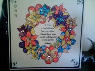
This was my second contribution to the day. I originally did this with laminated flowers (last months blog for Sundae club) and I "borrowed" the idea from a lady from Sheena Douglass's design team, unfortunately I don't think they gave her name out on the TV or I would put a link on for her.  This is a larger version of the one I did last month, and with the benefit of hind sight I think it would look better with just one shape of flower.

So you will need:
8 x 8 card, and card for matting and layering.
Decorative corner punch.
Odd bits of papers in various colours and patterns.
Circle die, or something round to give you a circle shape.
Sentiment stamp (I used one of Barbara Gray's)
Flowers stamps (I used Sheena Douglass's fantasy flowers)
Gems, Embossing powder, Black ink pad, Glue.


  • Firstly stamp and cut out lots of flowers in various sizes and onto various coloured and patterned papers (really good for using up your bits!) There is a lot of cutting out so easy shapes would be way to go I think.
  • I used an 8 x 8 card and matted and layered in quarter inch increments.
  • Punch out each corner of the top layer with a decorative punch, and stick all the layers onto the card.
  • Cut a circle from the same cardstock (I used the largest of the Spellbinders standard circle dies) and stamp and emboss the verse onto the middle of the circle.
  • Stick the verse onto your card, then arrange the flowers around the circle. I curled the petals of some of mine to give them a bit more dimension, and used 3d foam on some for height. Decorate the centres of the flowers with gems, and put a few gems in the corners and you are done.

Well those were my two cards, but these next two are my take on the ones Janet demonstrated, you will find her original ideas on her blog  Cards, Cats and Coffee. in a day or two.


This isn't a very good photo, the colours haven't come out very well, but I thought this would be a really nice wedding card.


Janet's original was done with Barbara Gray's hollyhock stamp, but I did mine with Sheena's fantasy flowers again. (One of my favourite stamp sets!) I also added some sparkly embossing to the background.Do go to Janet's blog and have a look, there are some lovely cards on there.


Thank you all for taking the time to have a look at this blog, please feel free to comment if you wish, at the moment I have left the comment security open to anyone, and I will leave it like that unless it is being abused.  
I'm off now to see how many mole hills have appeared whilst I have been writing this!
The sun is set to return tomorrow, so enjoy!
Moira

Wednesday 26 June 2013

Made a few cards for charity.

Good afternoon, it's a nice bright day in East Anglia today, all the cats are out in the garden, most of the neighbourhood dogs are basking in the sunshine in their respective gardens, and when I have finished this blog, I shall be joining them, so it's likely to be a quickie!
Below is a selection of cards that I have made using cannibalised commercial greetings cards that various friends have donated to me.  Even if you can't use the image the cardstock is brilliant for using with the Gelli plate, the reverse side of the image is after all just card. I also discovered (by accident) that if you put a Gelli print onto the shiny side of the card, you sometimes get a ghostly apparition of the original image coming through, it is really cool when that happens!
Obviously because of the commercial nature of the images I have used, I can't sell these cards, so my plan is to have a coffee morning later in the year and offer them for a donation. All the money will go to the MS Society, which for obvious reasons is a charity that is very close to my heart.


So this is the whole selection, and below you will find the individual cards with a brief description of how I made them.


So this one was originally just the image of the two birds on the cherry blossom. It is just matted and layered onto black and two shades of pink card, with an abundance of die cut swirls, twiddly roses, leaves and die cut bird cage and yet more swirls. The tiny flowers in the bird cage are made from paper clay - watch this space for more info on paper clay!


My favourite! The image is cut from the original greetings card, then mounted onto dark brown card which has hearts stamped and clear embossed onto it. The paper flowers are from a kit from Stephanie Weightman (not sure if thats the right spelling - sorry Steph!) The swirls and leaves are cut from the rest of the original card, so they all match. Card candie in the centre of the flowers.


The original card is the background paper on this one. Just added swirls and flowers and a couple of butterflies. The reason for all the peel-offs and corners etc, is that I could not get the damned thing on straight, so I used border p/o's, but they wouldn't stick down on the corners, hence the rather over the top (even for me) corner p/o's.


All I did here was to cut the image down a bit, add a few gems, and mat and layer. Took about five minutes, but I really like this one.


More matting and layering, I did foil the edges of the image, and add the flowers down the left side though.


Matted on to gold and then onto a dark brown card, peel off round the edges (same reason as before - I so need new glasses). Added the sentiment to hide the one that was already there, and added the butterfly on the left and the one on the sentiment.


This one hasn't photographed very well, the colours are much more distinct in reality. Mounted the image onto brown and then pink. The green background was clear embossed with dandylion clocks and then I put a strip of ribbon onto a strip of brown and stuck it down the right hand side.


The original card was the floral poppy image, again I foiled the edges of the image and offset it with the piece of white card. Matted onto bright pink, which in turn went onto the white base card, added swirls (having a bit of swirly day today) and again used paper clay flowers. It looked OK, but needed something else, so I added the butterfly, on the premise that everything looks better if it has a butterfly on it!

Hope you have enjoyed looking at these cards.  I had fun making them, and I used up quite a lot of bits that have been lying around for ages. So don't chuck your old cards out, even if you can't use the images on them, you can use the cardstock with your Gelli.

Thank you for looking, 'til the next time, have fun!